Visual Clutter: Difference between revisions
Undo revision 151576 by 46.118.117.146 (talk) |
|||
| (29 intermediate revisions by 5 users not shown) | |||
| Line 1: | Line 1: | ||
== Definition == | == Definition == | ||
{{Quotation|Clutter is the state in which excess items, or their representation or organization, lead to a degradation of performance at some task. |[Rosenholtz et al., 2005]}} | |||
* Clutter may refer to any of the following: | * Clutter may refer to any of the following: | ||
| Line 23: | Line 25: | ||
* An assortment of graphics for promotions and advertisements | * An assortment of graphics for promotions and advertisements | ||
* Logos for various affiliates, memberships, and awards | * Logos for various affiliates, memberships, and awards | ||
* Copyright notices and other legal disclaimers | * Copyright notices and other legal disclaimers [Meadhra, 2004] | ||
An example for this is the first page of GMX.at. This page is full of commercials and news headlines. One popular service of GMX is its webmail service. The login form is surrounded by visual clutter and it is easy to be overlooked. | |||
[[Image:0225061_01_Screen3.jpg|thumb|200px|none|GMX.at start page]] | |||
== Geological Maps == | |||
Visual Clutter in the Topographic Base of Geological Maps | |||
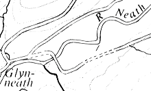
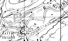
Geological maps are arguably the most complicated visual displays in common use and so they were a good subject for an experiment to understand the nature of visual clutter. But this experiment also tackles the practical problem of how best to simplify the topographic base on geological maps. | Geological maps are arguably the most complicated visual displays in common use and so they were a good subject for an experiment to understand the nature of visual clutter. But this experiment also tackles the practical problem of how best to simplify the topographic base on geological maps. | ||
[[Image: | [[Image:Erste.png]] | ||
[[Image: | [[Image:zweite1.png]] [[Image:dritte1.png]][[Image:vierte1.png]][[Image:fünfte1.png]] | ||
[[Image:sechs1.png]] | |||
| Line 42: | Line 48: | ||
Here is a small detail from one of the test maps used in the experiments and examples of the five types of topographic base which were compared: 'full', 'line', 'point', 'minimal' and 'design'. These bases were printed in grey and geological information was superimposed. The experiment compared the relative importance of line symbols and point symbols in causing visual clutter, but account was also taken of the importance placed on different topographic symbols by professional map users. | Here is a small detail from one of the test maps used in the experiments and examples of the five types of topographic base which were compared: 'full', 'line', 'point', 'minimal' and 'design'. These bases were printed in grey and geological information was superimposed. The experiment compared the relative importance of line symbols and point symbols in causing visual clutter, but account was also taken of the importance placed on different topographic symbols by professional map users. | ||
Abstract - Visual clutter on maps is a familiar experience but its precise nature is only poorly understood. Clutter was investigated in an experiment using a 1:50 000 geological map. Twelve representative map reading tasks were used to compare map reading performance on maps which differed only in their topographic base. The aim was to assess the effect of removing topographic symbols which are of only minor importance to the map reader. This reduction in visual clutter significantly improved performance on a number of the questions. Some evidence was obtained to support the hypothesis that line symbols clutter other line symbols, and point symbols clutter other point symbols, but there is little effect between the two. In practical terms the removal of minor point symbols and type led to larger improvements than the removal of minor line symbols, even though more of the latter were deleted. The relevance of the experiment to other geological maps, and to maps in general, is discussed. [ | Abstract - Visual clutter on maps is a familiar experience but its precise nature is only poorly understood. Clutter was investigated in an experiment using a 1:50 000 geological map. Twelve representative map reading tasks were used to compare map reading performance on maps which differed only in their topographic base. The aim was to assess the effect of removing topographic symbols which are of only minor importance to the map reader. This reduction in visual clutter significantly improved performance on a number of the questions. Some evidence was obtained to support the hypothesis that line symbols clutter other line symbols, and point symbols clutter other point symbols, but there is little effect between the two. In practical terms the removal of minor point symbols and type led to larger improvements than the removal of minor line symbols, even though more of the latter were deleted. The relevance of the experiment to other geological maps, and to maps in general, is discussed. [Phillips, 1982] | ||
== Bibliography == | == Bibliography == | ||
:[Rosenholtz et al., 2005] Ruth Rosenholtz, Yuanzhen Li, Jonathan Mansfield, and Zhenlan Jin. Feature Congestion: A Measure of Display Clutter. http://web.mit.edu/rruth/www/Papers/RosenholtzEtAlCHI2005Clutter.pdf | :[Rosenholtz et al., 2005] Ruth Rosenholtz, Yuanzhen Li, Jonathan Mansfield, and Zhenlan Jin. Feature Congestion: A Measure of Display Clutter. Retrieved at: Nov 24, 2009. http://web.mit.edu/rruth/www/Papers/RosenholtzEtAlCHI2005Clutter.pdf | ||
:[Meadhra, 2004] Michael Meadhra, Reduce visual clutter to improve usability. Created at: May 20, 2004. Retrieved at: Oct 24, 2005. http://www.builderau.com.au/program/web/0,39024632,39129000,00.htm | |||
:[Phillips, 1982] Richard J. Phillips. An Investigation of Visual Clutter in the Topographic Base of a Geological Map. ''The Cartographic Journal'', Vol.19, No.2: 122-132, December 1982. http://richardphillips.org.uk/maps/symbols.html#ge | |||
: | [[Category:Glossary]] | ||
Latest revision as of 10:17, 18 May 2015
Definition
- Clutter may refer to any of the following:
- A confusing or disorderly state or collection; or the creation thereof. Excessive, unnecessary or uncontrolled clutter in a home or office is a sign of compulsive hoarding.
- Cluttering, a communication disorder
- The Clutter family, whose murder was documented in the Truman Capote "nonfiction novel" In Cold Blood
- A type of light pollution
- Unwanted echoes in electronic systems, particularly in refference to radars. Such echoes are typically returned from ground, sea, rain, animals, chaff and atmospheric turbulences.
- The jumble of odd posts placed in the first Top Level Post of a User Friendly member's diary by the Cluttersquad http://en.wikipedia.org/wiki/Clutter
Introduction
Clutter is an important phenomenon in our lives, and an important consideration in the design of user interfaces and information visualizations. Many existing visualization systems are designed to reduce clutter by filtering what objects or information the user sees, or using non-linear magnification techniques so that objects in the center of the screen are allowed more display area. Tips for designing web pages, maps, and other visualizations often focus on techniques for displaying a large amount of information while keeping clutter to a minimum through careful choices of representation and organization of that information. [Rosenholtz et al., 2005]
Web pages
A home page might contain a logo and tag line, an attractive graphic, some site navigation buttons, and a welcome message. Now, it's common to see all of that and much more, including:
- Headlines and text for multiple news items
- Separate headers and quick links for several site features
- An assortment of graphics for promotions and advertisements
- Logos for various affiliates, memberships, and awards
- Copyright notices and other legal disclaimers [Meadhra, 2004]
An example for this is the first page of GMX.at. This page is full of commercials and news headlines. One popular service of GMX is its webmail service. The login form is surrounded by visual clutter and it is easy to be overlooked.

Geological Maps
Visual Clutter in the Topographic Base of Geological Maps
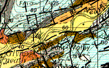
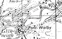
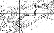
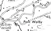
Geological maps are arguably the most complicated visual displays in common use and so they were a good subject for an experiment to understand the nature of visual clutter. But this experiment also tackles the practical problem of how best to simplify the topographic base on geological maps.
Here is a small detail from one of the test maps used in the experiments and examples of the five types of topographic base which were compared: 'full', 'line', 'point', 'minimal' and 'design'. These bases were printed in grey and geological information was superimposed. The experiment compared the relative importance of line symbols and point symbols in causing visual clutter, but account was also taken of the importance placed on different topographic symbols by professional map users.
Abstract - Visual clutter on maps is a familiar experience but its precise nature is only poorly understood. Clutter was investigated in an experiment using a 1:50 000 geological map. Twelve representative map reading tasks were used to compare map reading performance on maps which differed only in their topographic base. The aim was to assess the effect of removing topographic symbols which are of only minor importance to the map reader. This reduction in visual clutter significantly improved performance on a number of the questions. Some evidence was obtained to support the hypothesis that line symbols clutter other line symbols, and point symbols clutter other point symbols, but there is little effect between the two. In practical terms the removal of minor point symbols and type led to larger improvements than the removal of minor line symbols, even though more of the latter were deleted. The relevance of the experiment to other geological maps, and to maps in general, is discussed. [Phillips, 1982]
Bibliography
- [Rosenholtz et al., 2005] Ruth Rosenholtz, Yuanzhen Li, Jonathan Mansfield, and Zhenlan Jin. Feature Congestion: A Measure of Display Clutter. Retrieved at: Nov 24, 2009. http://web.mit.edu/rruth/www/Papers/RosenholtzEtAlCHI2005Clutter.pdf
- [Meadhra, 2004] Michael Meadhra, Reduce visual clutter to improve usability. Created at: May 20, 2004. Retrieved at: Oct 24, 2005. http://www.builderau.com.au/program/web/0,39024632,39129000,00.htm
- [Phillips, 1982] Richard J. Phillips. An Investigation of Visual Clutter in the Topographic Base of a Geological Map. The Cartographic Journal, Vol.19, No.2: 122-132, December 1982. http://richardphillips.org.uk/maps/symbols.html#ge
