2006-05-29: Websites as graphs: Difference between revisions
Jump to navigation
Jump to search
Removed SPAM |
m Reverted edit of OczPh4, changed back to last version by Iwolf |
| (5 intermediate revisions by 2 users not shown) | |
(No difference)
| |
Latest revision as of 08:49, 28 August 2007

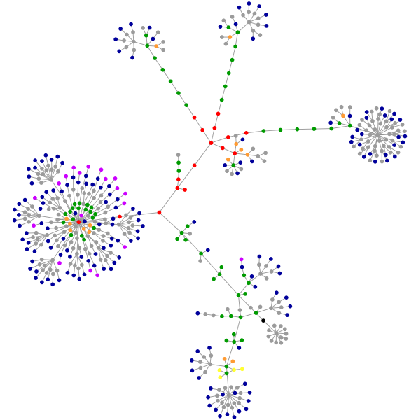
Structure of http://www.infovis-wiki.net
[Aharef, 2006]
Everyday, we look at dozens of websites. The structure of these websites is defined in HTML, the lingua franca for publishing information on the web. Your browser's job is to render the HTML according to the specs (most of the time, at least). You can look at the code behind any website by selecting the "View source" tab somewhere in your browser's menu.
HTML consists of so-called tags, like the A tag for links, IMG tag for images and so on. Since tags are nested in other tags, they are arranged in a hierarchical manner, and that hierarchy can be represented as a graph. I've written a little app that visualizes such a graph, and here are some screenshots of websites that I often look at.
I've used some color to indicate the most used tags in the following way:
blue: for links (the A tag)
red: for tables (TABLE, TR and TD tags)
green: for the DIV tag
violet: for images (the IMG tag)
yellow: for forms (FORM, INPUT, TEXTAREA, SELECT and OPTION tags)
orange: for linebreaks and blockquotes (BR, P, and BLOCKQUOTE tags)
black: the HTML tag, the root node
gray: all other tags
[Aharef, 2006]
Details: http://www.aharef.info/2006/05/websites_as_graphs.htm
References
[Aharef, 2006] Aharef Weblog, Websites as graphs, Created at: May 25, 2006, Retrieved at: May 29, 2006, http://www.aharef.info/2006/05/websites_as_graphs.htm