Teaching:TUW - UE InfoVis WS 2006/07 - Gruppe 03 - Aufgabe 1 - Data Density: Difference between revisions
m (Authorname geändert) |
No edit summary |
||
| (14 intermediate revisions by 3 users not shown) | |||
| Line 1: | Line 1: | ||
[[Teaching:TUW - UE InfoVis WS 2009/10 - Gruppe 09 - Aufgabe 1 | Zurueck zu Aufgabe 1]] | |||
== Data Density == | |||
=== Definition === | |||
{{Quotation|Number of Data Points means the number of discrete data values represented on screen at an instant. |[Barth, 1997]}} | |||
=== Overview === | |||
The cognitive complexity of an image can be measured by data density (which can be measured by the number of points in a graph) [Dal Sasso Freitas et al., 2002]. | |||
<br/><br/> | |||
So data density provides information about how many information elements can be displayed on a defined panel. Therefore you need numerical values which relate the number of maximal at the same time presentable information elements to a display panel [Edlinger, 2006]. | |||
=== Charts and Graphics === | |||
In general, Tufte assumes that the greater amount of data represented per square centimeter of print, the more effective the resulting representation [Barth, 1997]. | |||
Hence he discussed in his work "The Visual Display of Quantitative Information", which is a milestone in the theory of graph design, principles of graph design. One of them is: Try to maximize the data density and the size of the data matrix, within reason. Furthermore as the volume of data increases, data measures must shrink and the graphics can be shrunk way down [Tufte, 1999]. | |||
<br /> <br /> | |||
So graphics are at their best when they represents very dense and rich datasets because the human eye/brain can select, filter, edit, group, structure, highlight, focus, blend, outline, cluster, itemize, winnow, sort, abstract, smooth, isolate, idealize, summarize, etc. Give people the data so they can exercise their full powers -- don't limit them. | |||
Note that low data densities on computer displays force us to view information sequentially, rather than spatially, which is bad for comprehension [Smith, 2005]. | |||
<br/> | |||
Example for data densities include [Smith, 2005]: | |||
* 110,000 numbers/sq-inch for an astronomical graph. This is the maximum known density for a graph to compare. For most scientific journals we get about 50-200 numbers/sq-inch. | |||
* 150 Mbits = human eye | * 150 Mbits = human eye | ||
:8 Mbits = typical computer screen | |||
:25 Mbits = color slide | |||
:150 Mbits = large foldout map | |||
:28,000 Characters = Reference book | |||
:18,000 Characters = phone book | |||
:15,000 Characters = non-fiction | |||
== Example == | === Example === | ||
To better understand this term, we show two graphs and compute their data density. Consider the result of a survey in which the gender, height and weight were recorded for 92 students. The charts are 5.6cm by 7.4cm, an area of 41.4cm2 | To better understand this term, we show two graphs and compute their data density. Consider the result of a survey in which the gender, height and weight were recorded for 92 students. The charts are 5.6cm by 7.4cm, an area of 41.4cm2 [Hunt and Tyrrell, 1995]. | ||
[[Image: | [[Image:Barplot1.GIF]] | ||
[[Image: | [[Image:NewScatterplot.GIF]] | ||
Above you see a bar graph showing the breakdown into males and females. | Above you see a bar graph showing the breakdown into males and females. | ||
According to the definition you | According to the definition you have 2 (female and male) areas with 2 kind of information (gender and number of students), what makes 4 data points. By dividing this over the size of its area, you get the data density of this graph [Barth, 1997]. | ||
data density = 4 / 41.4 = 0.1 (to 1 dp) | |||
The computation of the second example works similar to the first one. The second graph shows a labeled XY-chart, which additionally shows the relationship between height and weight of the students. As a result you have 3 kind of information on 92 areas, what results 276 data points [Barth, 1997]. | |||
data density = 276 / 41.4 = 6.7 (to 1 dp) | |||
'''Another Example:''' 50 information elements on a 200x200 display panel delivers | |||
50/(200*200) = 0,00125 information elements/pixel | |||
<br /> <br /> | |||
---- | |||
== References == | == References == | ||
| Line 59: | Line 55: | ||
[Dal Sasso Freitas et al., 2002] Carla M. Dal Sasso Freitas, Paulo R. G. Luzzardi, Ricardo A. Cava, Marco A. A. Winckler, Marcelo S. Pimenta, Luciana P. Nedel. Evaluating Usability of Information Visualization Techniques. In ''Proceedings of 5th Symposium on Human Factors in Computer Systems (IHC)'', pages 10-11, Fortaleza, CE, 2002. Fortaleza:SBC | [Dal Sasso Freitas et al., 2002] Carla M. Dal Sasso Freitas, Paulo R. G. Luzzardi, Ricardo A. Cava, Marco A. A. Winckler, Marcelo S. Pimenta, Luciana P. Nedel. Evaluating Usability of Information Visualization Techniques. In ''Proceedings of 5th Symposium on Human Factors in Computer Systems (IHC)'', pages 10-11, Fortaleza, CE, 2002. Fortaleza:SBC | ||
[Edlinger, 2006] Karl Edlinger, Informationsvisualisierung im Wissensmanagement – Eine Analyse unterschiedlicher Visualisierungstechniken auf ihre Eignung für das Wissensmanagement, Master's thesis, Fachhochschul-Studiengang Informationsberufe, Eisenstadt, 2006 | [Edlinger, 2006] Karl Edlinger, Informationsvisualisierung im Wissensmanagement – Eine Analyse unterschiedlicher Visualisierungstechniken auf ihre Eignung für das Wissensmanagement, Master's thesis, Fachhochschul-Studiengang Informationsberufe, Eisenstadt, 2006 | ||
[Hunt and | [Hunt and Tyrrell, 1995] Neville Hunt and Sidney Tyrrell, Discovering Important Statistical Concepts Using SpreadSheets. Retrieved at: April 07, 2008. http://www.coventry.ac.uk/ec/research/discus/discus_home.html | ||
[Smith, 2005] Waynes Smith | [Smith, 2005] Waynes Smith. Graphics and Web Design Based on Edward Tufte's Principles. Created at: January 17, 2005. Retrieved at: October 29, 2006. http://www.washington.edu/computing/training/560/zz-tufte.html | ||
[Tufte, 1999] Edward R. Tufte | [Tufte, 1999] Edward R. Tufte. The Visual Display of Quantitative Information. Created at: January 26, 1999. Retrieved at: October 29, 2006. http://ldt.stanford.edu/ldt1999/Students/mizuno/Portfolio/Work/reports/tufte/ed229c-tufte-outline.html | ||
Latest revision as of 12:50, 21 November 2009
Data Density[edit]
Definition[edit]
Overview[edit]
The cognitive complexity of an image can be measured by data density (which can be measured by the number of points in a graph) [Dal Sasso Freitas et al., 2002].
So data density provides information about how many information elements can be displayed on a defined panel. Therefore you need numerical values which relate the number of maximal at the same time presentable information elements to a display panel [Edlinger, 2006].
Charts and Graphics[edit]
In general, Tufte assumes that the greater amount of data represented per square centimeter of print, the more effective the resulting representation [Barth, 1997].
Hence he discussed in his work "The Visual Display of Quantitative Information", which is a milestone in the theory of graph design, principles of graph design. One of them is: Try to maximize the data density and the size of the data matrix, within reason. Furthermore as the volume of data increases, data measures must shrink and the graphics can be shrunk way down [Tufte, 1999].
So graphics are at their best when they represents very dense and rich datasets because the human eye/brain can select, filter, edit, group, structure, highlight, focus, blend, outline, cluster, itemize, winnow, sort, abstract, smooth, isolate, idealize, summarize, etc. Give people the data so they can exercise their full powers -- don't limit them.
Note that low data densities on computer displays force us to view information sequentially, rather than spatially, which is bad for comprehension [Smith, 2005].
Example for data densities include [Smith, 2005]:
- 110,000 numbers/sq-inch for an astronomical graph. This is the maximum known density for a graph to compare. For most scientific journals we get about 50-200 numbers/sq-inch.
- 150 Mbits = human eye
- 8 Mbits = typical computer screen
- 25 Mbits = color slide
- 150 Mbits = large foldout map
- 28,000 Characters = Reference book
- 18,000 Characters = phone book
- 15,000 Characters = non-fiction
Example[edit]
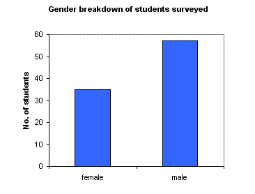
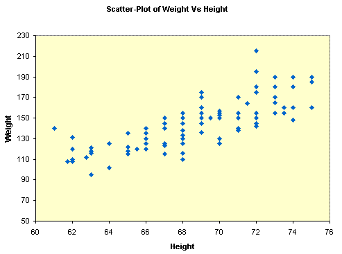
To better understand this term, we show two graphs and compute their data density. Consider the result of a survey in which the gender, height and weight were recorded for 92 students. The charts are 5.6cm by 7.4cm, an area of 41.4cm2 [Hunt and Tyrrell, 1995].
Above you see a bar graph showing the breakdown into males and females. According to the definition you have 2 (female and male) areas with 2 kind of information (gender and number of students), what makes 4 data points. By dividing this over the size of its area, you get the data density of this graph [Barth, 1997].
data density = 4 / 41.4 = 0.1 (to 1 dp)
The computation of the second example works similar to the first one. The second graph shows a labeled XY-chart, which additionally shows the relationship between height and weight of the students. As a result you have 3 kind of information on 92 areas, what results 276 data points [Barth, 1997].
data density = 276 / 41.4 = 6.7 (to 1 dp)
Another Example: 50 information elements on a 200x200 display panel delivers
50/(200*200) = 0,00125 information elements/pixel
References[edit]
[Barth, 1997] R. Barth. Metrics for effective information visualization. In Proceedings of the 1997 IEEE Symposium on Information Visualization (InfoVis '97), pages 0–108, DC, USA, October 1997. IEEE Computer Society Washington
[Dal Sasso Freitas et al., 2002] Carla M. Dal Sasso Freitas, Paulo R. G. Luzzardi, Ricardo A. Cava, Marco A. A. Winckler, Marcelo S. Pimenta, Luciana P. Nedel. Evaluating Usability of Information Visualization Techniques. In Proceedings of 5th Symposium on Human Factors in Computer Systems (IHC), pages 10-11, Fortaleza, CE, 2002. Fortaleza:SBC
[Edlinger, 2006] Karl Edlinger, Informationsvisualisierung im Wissensmanagement – Eine Analyse unterschiedlicher Visualisierungstechniken auf ihre Eignung für das Wissensmanagement, Master's thesis, Fachhochschul-Studiengang Informationsberufe, Eisenstadt, 2006
[Hunt and Tyrrell, 1995] Neville Hunt and Sidney Tyrrell, Discovering Important Statistical Concepts Using SpreadSheets. Retrieved at: April 07, 2008. http://www.coventry.ac.uk/ec/research/discus/discus_home.html
[Smith, 2005] Waynes Smith. Graphics and Web Design Based on Edward Tufte's Principles. Created at: January 17, 2005. Retrieved at: October 29, 2006. http://www.washington.edu/computing/training/560/zz-tufte.html
[Tufte, 1999] Edward R. Tufte. The Visual Display of Quantitative Information. Created at: January 26, 1999. Retrieved at: October 29, 2006. http://ldt.stanford.edu/ldt1999/Students/mizuno/Portfolio/Work/reports/tufte/ed229c-tufte-outline.html

