Teaching:TUW - UE InfoVis WS 2007/08 - Gruppe 08 - Aufgabe 4: Difference between revisions
mNo edit summary |
mNo edit summary |
||
| (2 intermediate revisions by the same user not shown) | |||
| Line 23: | Line 23: | ||
** The columns are all measured in different units | ** The columns are all measured in different units | ||
** the colums have different reference intervals | ** the colums have different reference intervals | ||
* | * The lab results are incomplete | ||
** | ** Some of the reference values in the first results are missing | ||
** | ** The column "P" is not explained, only by looking at the data can you assume that this stands for "Problem" | ||
** | ** Column "P" can easily be over looked | ||
** "P" | ** "P" doesn't tell you if you are above or below the reference values | ||
** | ** There are no definitions for the abreviations used in the "untersuchungen" column | ||
** | ** Some rows don't list what unit the measurement is in | ||
* | * The visualisation does not express if this is one or two persons data. | ||
==== Description of the provided data ==== | ==== Description of the provided data ==== | ||
| Line 43: | Line 43: | ||
* The patient cannot perform the analysis himself, he needs a laberatory to at least analyze the blood. | * The patient cannot perform the analysis himself, he needs a laberatory to at least analyze the blood. | ||
==== | ==== Frequently used Visualisation techniques in this area ==== | ||
Judging from personal experience the pictures at the top are in fact a frequently used method to try to visualize the data for the patient. | |||
=== | === Goal of own Visualisation === | ||
* Patients should be informed about their results in a way that allows them to understand the results without the direct supervision of a doctor. | |||
* | * The visualisation tool should help patients see what affects their results such as sleep deprevation, bad neutrition, no fitness. | ||
* | * Additionally the tool should make automatic suggestions on what a person can do to improve their future results (eat more carrots, swim for 20 minutes 3 times a week, etc) | ||
* | * Tracking the changes of their results should also be simplified | ||
* | |||
==== | ==== Which tasks are to be solved ==== | ||
* | * visually show if a row is above or below the reference area, and by how much | ||
* | * visually compare different results over time | ||
** | ** How have all the values changed over time | ||
** | ** Which rows are no longer within the reference values, which ones are | ||
==== | * Different sorting of rows, eg grouping by involved organs to show possible damaged organs. Sorting/filtering out the problematic rows. | ||
* | ==== Questions that can be solved using the new visualisation ==== | ||
* | * How is my heath developing over time | ||
* | * What can I do to improve my cholesterol | ||
* | * Which of my blood values are the worst | ||
* Why might my eisen value be so low | |||
In all cases however the visualisation is to state that these are automated suggestions and that they should be discussed with a docutor. | |||
== | == Concept == | ||
=== Mockup(s) / Fake Screenshot(s) === | === Mockup(s) / Fake Screenshot(s) === | ||
==== General result screen with the mouse being over a particular result ==== | |||
[[Image:auf4_2.JPG]] | [[Image:auf4_2.JPG]] | ||
==== A screen shot demonstrating the historical comperison visualisation ==== | |||
[[Image:auf4_3.JPG]] | [[Image:auf4_3.JPG]] | ||
=== Through which characteristics are users especially aided? === | |||
=== | * Details on Demand (= Tooltips). By hovering the mouse over an icon or a particular result more details are shown. These details are generally hidden to reduce visual clutter. | ||
* Details on Demand (= Tooltips) | * History comparison - By draging along a horiztonal bar one can compare ones previous results with the current result | ||
* | * Values outside the reference area are highlighted by being within a "red area" | ||
* | * Automatically generated general tips based on the results and the patient data | ||
* | * Different sorting - By clicking on icons the patient can quickly change the way the data is sorted (ie alphabetically, worst values, organ grouping, etc) | ||
=== | |||
=== Disadvantages === | |||
The main drawback of the new system is that it requires the patient to be able to use a computer and have one available. Of course the results can be printed out, but the full feature set is only available on a computer. | |||
=== Possible future enhancements === | |||
=== | * Automatic diet plan generation which generates an example of "healthy eating" for the selected person based on his data | ||
* | |||
* A chat program to talk about ones results with the doctor or with other patients. | |||
* | |||
Latest revision as of 02:04, 24 January 2008
Aufgabenstellung[edit]
Aufgabe ist das Design einer interaktiven Visualisierungsapplikation zur Darstellung und Exploration
(des zeitlichen Verlaufs) von Laborwerten einer Blutuntersuchung. BenutzerInnen, Einsatzzweck, Tasks, etc.
sollen von Euch selbst festgelegt und beschrieben werden.
Beispiele für derartige Datensätze[edit]
Description of the example[edit]
Explanation of the field and the data[edit]
Field Information[edit]
The field of our example is medicine, or more precicely, a blood analysis of one (or more) patients.
Charactaristics of the Field[edit]
- Different charateristics can be sampled in different blood tests.
- Increases the difficulty of creating visual represenations.
- Increates the difficulty of visualising changes in data.
- Its not easy to visualize the data in traditional ways (bars, pie charts..), because...
- The columns are all measured in different units
- the colums have different reference intervals
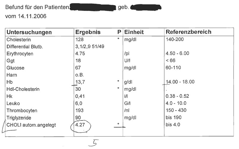
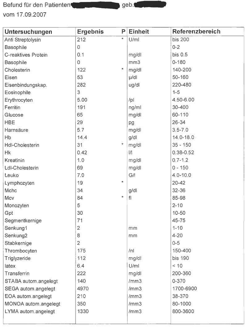
- The lab results are incomplete
- Some of the reference values in the first results are missing
- The column "P" is not explained, only by looking at the data can you assume that this stands for "Problem"
- Column "P" can easily be over looked
- "P" doesn't tell you if you are above or below the reference values
- There are no definitions for the abreviations used in the "untersuchungen" column
- Some rows don't list what unit the measurement is in
- The visualisation does not express if this is one or two persons data.
Description of the provided data[edit]
The data in this example shows the blood sample data of one or two patients. It also offers a reference which shows the patient if the value of a particular tuple is within normal bounds or not.
Target group analysis[edit]
Our visualisation is targeted at the actual patient and will try to help the patient understand his results without the direct help of a doctor as well as simplify the comparison of the patients data with previous results.
Charactaristics of the Target Group[edit]
- The patients generally do not understand what the results the received back actually mean as they are not doctors. They are more interested in what the result actually means rather than what is. (What is Erzthorizen?)
- The patients do not know what influences their result. When reading the data it alone is of no use to them, they are more interested in knowing the reasons for their values than the actual values themselves. (Why is my Erzthorizen so high?)
- The patient cannot perform the analysis himself, he needs a laberatory to at least analyze the blood.
Frequently used Visualisation techniques in this area[edit]
Judging from personal experience the pictures at the top are in fact a frequently used method to try to visualize the data for the patient.
Goal of own Visualisation[edit]
- Patients should be informed about their results in a way that allows them to understand the results without the direct supervision of a doctor.
- The visualisation tool should help patients see what affects their results such as sleep deprevation, bad neutrition, no fitness.
- Additionally the tool should make automatic suggestions on what a person can do to improve their future results (eat more carrots, swim for 20 minutes 3 times a week, etc)
- Tracking the changes of their results should also be simplified
Which tasks are to be solved[edit]
- visually show if a row is above or below the reference area, and by how much
- visually compare different results over time
- How have all the values changed over time
- Which rows are no longer within the reference values, which ones are
- Different sorting of rows, eg grouping by involved organs to show possible damaged organs. Sorting/filtering out the problematic rows.
Questions that can be solved using the new visualisation[edit]
- How is my heath developing over time
- What can I do to improve my cholesterol
- Which of my blood values are the worst
- Why might my eisen value be so low
In all cases however the visualisation is to state that these are automated suggestions and that they should be discussed with a docutor.
Concept[edit]
Mockup(s) / Fake Screenshot(s)[edit]
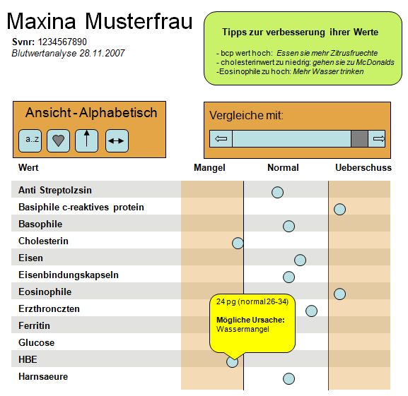
General result screen with the mouse being over a particular result[edit]
A screen shot demonstrating the historical comperison visualisation[edit]
Through which characteristics are users especially aided?[edit]
- Details on Demand (= Tooltips). By hovering the mouse over an icon or a particular result more details are shown. These details are generally hidden to reduce visual clutter.
- History comparison - By draging along a horiztonal bar one can compare ones previous results with the current result
- Values outside the reference area are highlighted by being within a "red area"
- Automatically generated general tips based on the results and the patient data
- Different sorting - By clicking on icons the patient can quickly change the way the data is sorted (ie alphabetically, worst values, organ grouping, etc)
Disadvantages[edit]
The main drawback of the new system is that it requires the patient to be able to use a computer and have one available. Of course the results can be printed out, but the full feature set is only available on a computer.
Possible future enhancements[edit]
- Automatic diet plan generation which generates an example of "healthy eating" for the selected person based on his data
- A chat program to talk about ones results with the doctor or with other patients.


