Data-Ink Ratio: Difference between revisions
No edit summary |
mNo edit summary |
||
| (18 intermediate revisions by 9 users not shown) | |||
| Line 1: | Line 1: | ||
== Definitions == | == Definitions == | ||
Tufte | The Data-Ink ratio is a concept introduced by Edward Tufte, the expert whose work has contributed significantly to designing effective data presentations. In his 1983 book, The Visual Display of Quantitative Data, he stated the goal: | ||
{{Quotation|''Above all else show the data''| Tufte, 1983}} | |||
{{quotation|''A large share of ink on a graphic should present data-information, the ink changing as the data change. Data-ink is the non-erasable core of a graphic, the non-redundant ink arranged in response to variation in the numbers represented.''|Tufte, 1983}} | |||
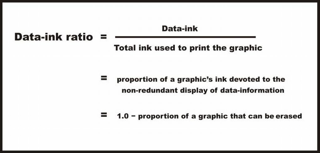
Tufte refers to data-ink as the non-erasable ink used for the presentation of data. If data-ink would be removed from the image, the graphic would lose the content. Non-Data-Ink is accordingly the ink that does not transport the information but it is used for scales, labels and edges. The data-ink ratio is the proportion of Ink that is used to present actual data compared to the total amount of ink (or pixels) used in the entire display. (Ratio of Data-Ink to non-Data-Ink). | |||
[[Image:DIR.jpg|thumb|600px|center]] | |||
<br> | Good graphics should include only data-Ink. Non-Data-Ink is to be deleted everywhere where possible. The reason for this is to avoid drawing the attention of viewers of the data presentation to irrelevant elements.<br> | ||
The goal is to design a display with the highest possible data-ink ratio (that is, as close to the total of 1.0), without eliminating something that is necessary for effective communication. | |||
== Example == | == Example == | ||
This is an example of a graph with a low Data-Ink Ratio. | |||
[[Image: | [[Image:Dir1.png|thumb|Low Data-Ink Ratio|400px|center]] | ||
The border around the graph, the background color and the grid lines are all unnecessary data ink. | |||
<br> | <br> | ||
| Line 44: | Line 33: | ||
Now an example of a graph with a high Data-Ink Ratio | Now an example of a graph with a high Data-Ink Ratio | ||
[[Image: | [[Image:Dir2.png|thumb|High Data-Ink Ratio|400px|center]] | ||
We have deleted the border around the graph, the background color and the grid lines and have thus drawn the viewer's attention to horizontal scales that are data-ink. There is nothing else to distract and the key features of the data stand out clearly. | |||
<br> | |||
== | == Criticism of Tufte's principles == | ||
Inbar, et al, evaluated in 2007 the people's acceptance of the minimalist approach to visualize information. | Inbar, et al, evaluated in 2007 the people's acceptance of the minimalist approach to visualize information. They asked 87 students to rate their preference for two different graphs displaying identical information - a standard bar-graph and a minimalist version. Both versions were taken from [Tufte, 1983]. [Inbar, 2007] | ||
The results showed that the majority students did not like Tufte's minimalist design of bar-graphs - instead they seem to prefer "chartjunk". [Inbar, 2007] | The results showed that the majority students did not like Tufte's minimalist design of bar-graphs - instead they seem to prefer "chartjunk". [Inbar, 2007] | ||
In the example shown above, increasing the data-ink ratio made it harder to read most of the data. For example, removing the top border of the chart removed an implied 20% line. It also made it harder to see how much the graph lies (in that it does not show a range from 0% to 100%, and/or does not show the domain from January through December). <I>How to Lie with Statistics</I> discusses this flaw in the example charts. | |||
== Quellen == | |||
[Few, 2004] Stephen Few. Elegance Through Simplicity. Created at: October 16, 2004. Retrieved at: October 25, 2005. http://www.intelligententerprise.com/showArticle.jhtml?articleID=49400920. | |||
[Few, Edge 2009] Stephen Few, . Perceptual Edge Sometimes We Must Raise Our Voices, Visual Business Intelligence Newsletter Created at: January/February 2009. http://www.perceptualedge.com/articles/visual_business_intelligence/sometimes_we_must_raise_our_voices.pdf. | |||
= | [Inbar, 2007]Ihad Inbar, Noam Tractinsky and Joachim Meyer. Minimalism in information visualization: attitudes towards maximizing the data-ink ratio. http://portal.acm.org/citation.cfm?id=1362587. | ||
[ | [Tufte, 1983] Edward Tufte. ''The Visual Display of Quantitative Information''. http://campusphere.de/datensicht/files/EdwardR.Tufte.%20Tufte | ||
Pictures: http://www.tbray.org/ongoing/data-ink/di1, http://www.tbray.org/ongoing/data-ink/di5 | |||
Latest revision as of 13:56, 22 August 2018
Definitions
The Data-Ink ratio is a concept introduced by Edward Tufte, the expert whose work has contributed significantly to designing effective data presentations. In his 1983 book, The Visual Display of Quantitative Data, he stated the goal:
Tufte refers to data-ink as the non-erasable ink used for the presentation of data. If data-ink would be removed from the image, the graphic would lose the content. Non-Data-Ink is accordingly the ink that does not transport the information but it is used for scales, labels and edges. The data-ink ratio is the proportion of Ink that is used to present actual data compared to the total amount of ink (or pixels) used in the entire display. (Ratio of Data-Ink to non-Data-Ink).

Good graphics should include only data-Ink. Non-Data-Ink is to be deleted everywhere where possible. The reason for this is to avoid drawing the attention of viewers of the data presentation to irrelevant elements.
The goal is to design a display with the highest possible data-ink ratio (that is, as close to the total of 1.0), without eliminating something that is necessary for effective communication.
Example
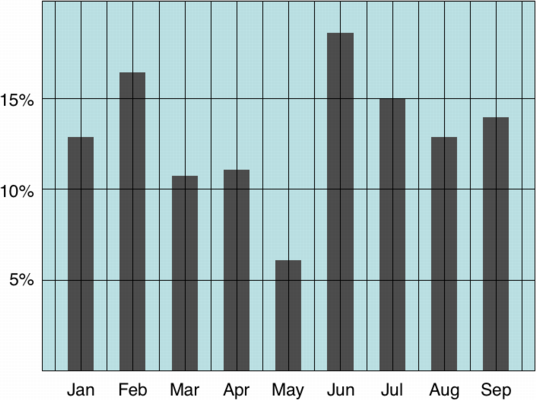
This is an example of a graph with a low Data-Ink Ratio.

The border around the graph, the background color and the grid lines are all unnecessary data ink.
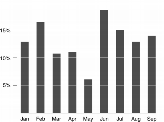
Now an example of a graph with a high Data-Ink Ratio

We have deleted the border around the graph, the background color and the grid lines and have thus drawn the viewer's attention to horizontal scales that are data-ink. There is nothing else to distract and the key features of the data stand out clearly.
Criticism of Tufte's principles
Inbar, et al, evaluated in 2007 the people's acceptance of the minimalist approach to visualize information. They asked 87 students to rate their preference for two different graphs displaying identical information - a standard bar-graph and a minimalist version. Both versions were taken from [Tufte, 1983]. [Inbar, 2007]
The results showed that the majority students did not like Tufte's minimalist design of bar-graphs - instead they seem to prefer "chartjunk". [Inbar, 2007]
In the example shown above, increasing the data-ink ratio made it harder to read most of the data. For example, removing the top border of the chart removed an implied 20% line. It also made it harder to see how much the graph lies (in that it does not show a range from 0% to 100%, and/or does not show the domain from January through December). How to Lie with Statistics discusses this flaw in the example charts.
Quellen
[Few, 2004] Stephen Few. Elegance Through Simplicity. Created at: October 16, 2004. Retrieved at: October 25, 2005. http://www.intelligententerprise.com/showArticle.jhtml?articleID=49400920.
[Few, Edge 2009] Stephen Few, . Perceptual Edge Sometimes We Must Raise Our Voices, Visual Business Intelligence Newsletter Created at: January/February 2009. http://www.perceptualedge.com/articles/visual_business_intelligence/sometimes_we_must_raise_our_voices.pdf.
[Inbar, 2007]Ihad Inbar, Noam Tractinsky and Joachim Meyer. Minimalism in information visualization: attitudes towards maximizing the data-ink ratio. http://portal.acm.org/citation.cfm?id=1362587.
[Tufte, 1983] Edward Tufte. The Visual Display of Quantitative Information. http://campusphere.de/datensicht/files/EdwardR.Tufte.%20Tufte
Pictures: http://www.tbray.org/ongoing/data-ink/di1, http://www.tbray.org/ongoing/data-ink/di5