Teaching:TUW - UE InfoVis WS 2008/09 - Gruppe 06 - Aufgabe 3
Aufgabenstellung
Zu beurteilende Grafik

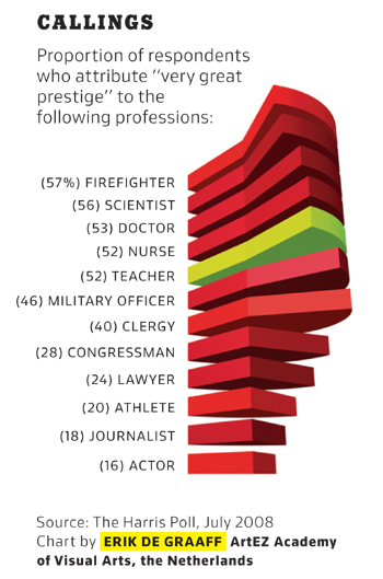
Proportion of respondents who attribute 'very great' prestige to professionals
Critical Review
Based on the design principles recorded by Few [2004], we discovered the following problems in the graphic shown above:
- Data objects with 3-D depth are used. These objects are hard to read. Furthermore, the graphical components added for 3-D depth do not convey any extra information (bad data ink ratio) [Few, 2004, p. 171].
- Through the use of pie charts, quantitative information is encoded by area. These types of graphs communicate poorly, because the human visual perception cannot accurately estimate the area of a 2-D shapes. In 3-D this is even harder [Few, 2004, p. 60].
- The numeric values are printed next to the categorical labels. This decreases the data-ink ratio. If we take into account the two points mentioned above, we can argue that the pie charts are non-data ink and only categorical labels and values are data ink.
- Except for "teachers" all pies are drawn in an intense color (highly saturated red). This draws a lot of attention to these pies, especially because red signals danger in most western cultures [Few, 2004, p. 171]. However, we think that the graphic's purpose is to highlight the proportion for "teachers". In that case the pie for "teachers" should be more intense [Few, 2004, p. 187].
- The categorical labels are printed in capitals. In this form text is less legible.
Improved Graphic
Improvements
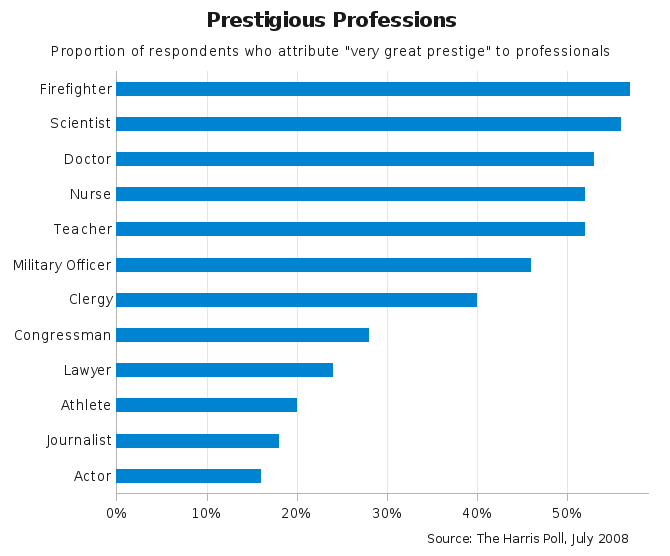
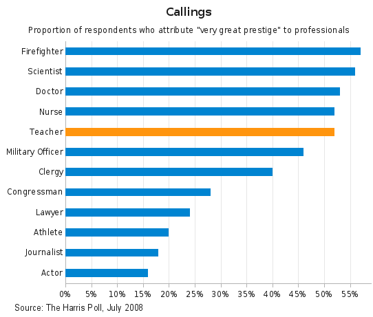
- We decided to use horizontal bars, because they are well suited for displaying ranking relationships [Few, 2004, p. 73, 182].
- We used blue color for the bars, removed the bar borders, and set a 1-to-1.5 ratio of bar to intervening white space.
- We colored the bar for "teachers" orange.
- On the categorical axis we switched off tick marks, because they are not needed. On the quantitative axis we put tick marks every 10%.
- To ease comparison and look-up of values, we used thin grid lines.
- Categorical labels were written in mixed case to improve legibility.
Links
References
- [Few, 2004] Stephen Few. Show Me the Numbers - Designing Tables and Graphs to Enlighten. Analytics Press, Oakland, CA, 2004.

