Teaching:TUW - UE InfoVis WS 2006/07 - Gruppe 01 - Aufgabe 2: Difference between revisions
| Line 108: | Line 108: | ||
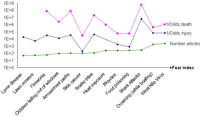
[[image:Aufgabe2Diagramm.png|none|thumb|500px|Remarks: Y-Axis is logarithmic; Risk catehories on X-Axis ordered by increasing "number of articles";]] | [[image:Aufgabe2Diagramm.png|none|thumb|500px|Remarks: Y-Axis is logarithmic; Risk catehories on X-Axis ordered by increasing "number of articles";]] | ||
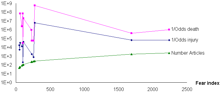
The same graphic as above with the real distances on the X-Axis instead of the uniform distance used above. First with all data-points then without the two outliers "Drowning (while boating)" and "West Nile Virus" as those are the only two points with an article count > 300. | |||
[[image:Verbessert_Trend_XAchse_V1.png|none|thumb|500px|none;]] | |||
[[Verbessert_Trend_XAchse_Klein_V1.png|none|thumb|500px|none;]] | |||
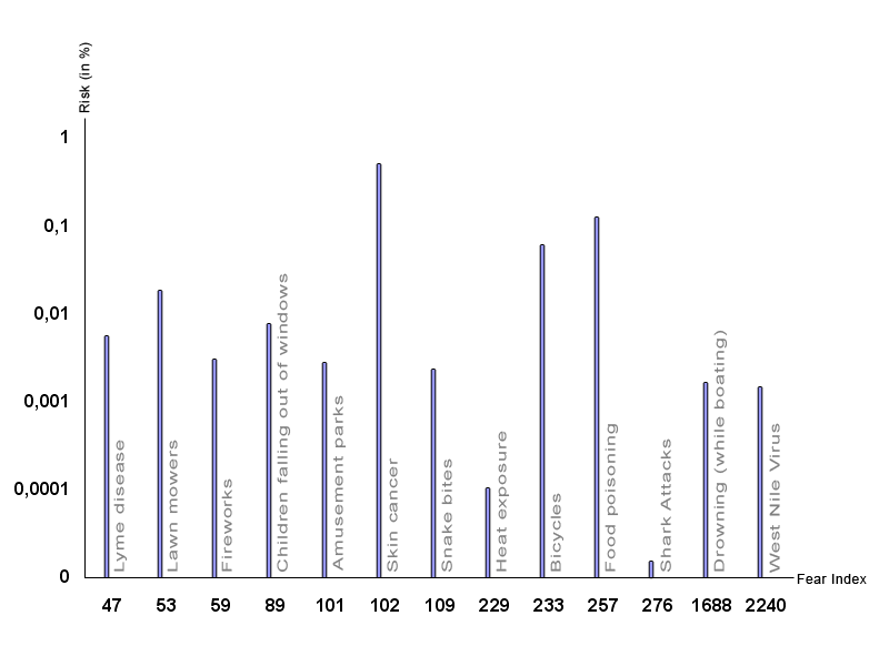
Another way of presenting the data is to use one total risk value for both the death and the injury odds. In that way we can simplifiy the graphic by using some kind of block diagram. The blocks represent the total risk in percent and are ordered by the number of articles. According to the author of the original graphic, the number of articles written about a risk is equal to the risk's fear index. Because of that, we'll also use the fear index as the x-axis inscription. In that way one can easily see, that there is absolutly no relation between people's fears and the risk of getting involved with the corresponding dangers. | Another way of presenting the data is to use one total risk value for both the death and the injury odds. In that way we can simplifiy the graphic by using some kind of block diagram. The blocks represent the total risk in percent and are ordered by the number of articles. According to the author of the original graphic, the number of articles written about a risk is equal to the risk's fear index. Because of that, we'll also use the fear index as the x-axis inscription. In that way one can easily see, that there is absolutly no relation between people's fears and the risk of getting involved with the corresponding dangers. | ||
Revision as of 14:28, 4 December 2006
Poor Graphic
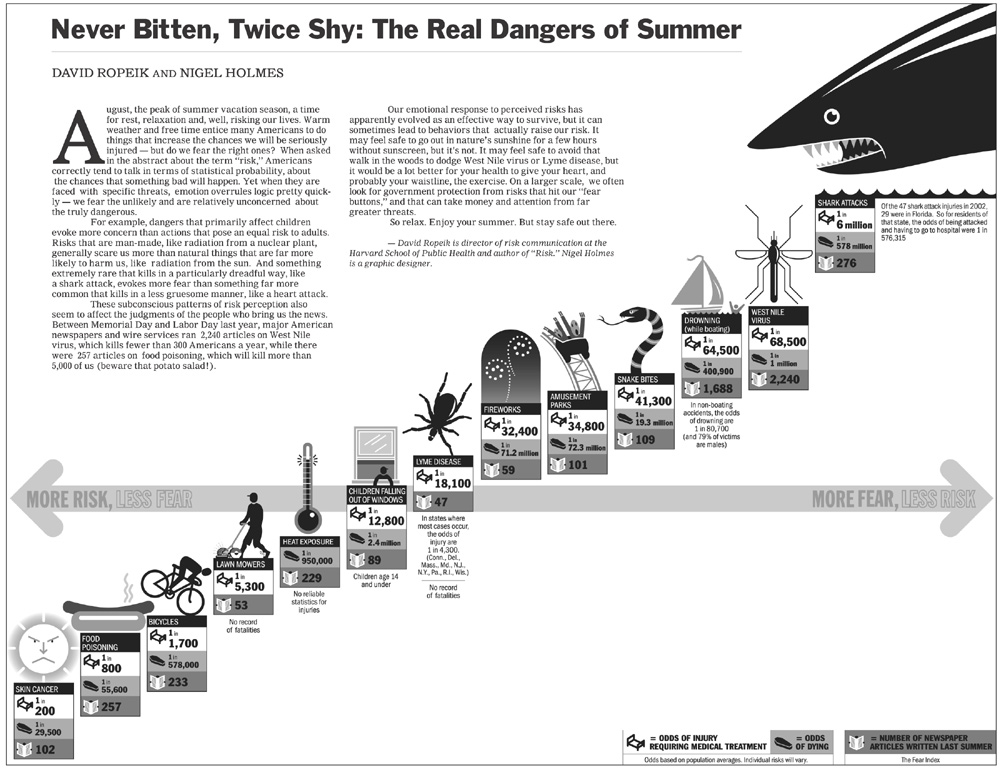
Discussion of the original graphic
First impressions
- The first thing one will notice when looking at this diagram is: The shark.
- The next things, that really catch one's eye are the other graphical symbols, arranged from bottom left to top right, which seem to stand in a linear relationship.
- Then you see the horizontal axis, positioned in the middle of the graphic, reading "More risk, less fear" on the left and "More fear, less risk" on the right.
- Then finally you get to notice the actual values and the legend - if you don't get distracted by the nearly unreadable article text in the upper left of the image.
Design
Before analyzing the actual data in the graphic we try to evaluate the graphic from a design point of view:
- Data-Ink-Ratio: This image has very bad Data-Ink-Ratio. As there are a huge number of visual elements (e.g. the huge shark) which not only are unnecessary to visualize the data itself, but even prevent/distract you from concentrating on the message of the graphic. They are completely dispensable as they add no information that is not already provided by the textual labels.
- Space: The image takes up a great amount of space but leaves entire regions of the graphic blank and so without use.
- Axis location: The location of the only axis in the diagram is somewhat misleading. The axis is placed in the middle of the diagram and suggesting a separation of the risk categories in some way (e.g. into a negative/positive region). There is no logical reason for locating the axis in the middle. A y-axis is not even displayed, although elements are also arranged vertically.
- Axis units: There is no real way to tell the units and/or the ranges for the x- and y-axes. The only hint is the text on the arrow which reads "More risk, less fear" on the left and "More fear, less risk" on the right. Now you could think the data is ordered from left to right by increasing fear and decreasing risk but that isn't the case. See below in the "Detailed analysis of the data"-section.
- Text on graphic: The article text in the upper left does not belong in the graphic itself and should be shown separately. As it is it is nearly unreadable due to its small size and distracting the viewer from the information in the graphic. Additionally there are some comments (e.g. on missing values or specific conditions under which these values were obtained) directly on the graph which again distract from its message, as the user has to read them to check if they contain important information (which mostly they don't).
- Data density: The graphic gets a pretty bad rating here too, as the amount of space (as stated above) used to show information about the dataset is in no relation to the number of elements in the set, which are only 13.
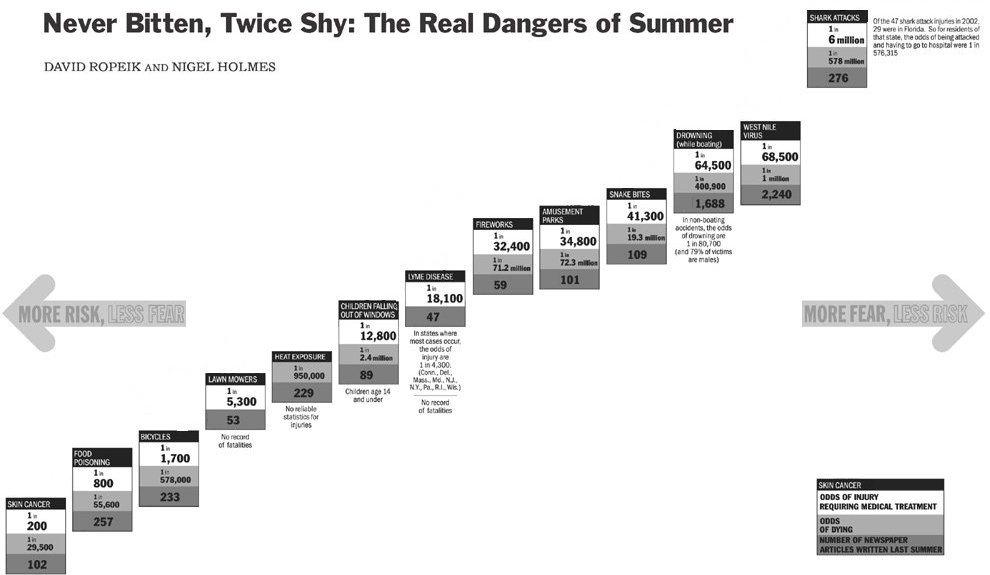
Only to show what can be accomplished by just an improvement of the Data-Ink-Ratio we created this simplification of the original graphic:
Detailed analysis of the data
The "The real risks of summer" data in table form
| Risk | Odds of injury1 | Odds of dying | Fear Index2 |
|---|---|---|---|
| Skin cancer | 1 in 200 | 1 in 29,500 | 102 |
| Food poisoning | 1 in 800 | 1 in 55,600 | 257 |
| Bicycles | 1 in 1,700 | 1 in 578,000 | 233 |
| Lawn mowers | 1 in 5300 | Not available | 53 |
| Heat exposure | Not available | 1 in 950,000 | 229 |
| Children falling out of windows | 1 in 12,800 | 1 in 2,400,000 | 89 |
| Lyme disease | 1 in 18,100 | Not available | 47 |
| Fireworks | 1 in 32,400 | 1 in 71,200,000 | 59 |
| Amusement parks | 1 in 34,800 | 1 in 72,300,000 | 101 |
| Snake bites | 1 in 41,300 | 1 in 19,300,000 | 109 |
| Drowning (while boating) | 1 in 64,500 | 1 in 400,900 | 1,688 |
| West Nile virus | 1 in 68,500 | 1 in 1,000,000 | 2,240 |
| Shark attacks | 1 in 6,000,000 | 1 in 578,000,000 | 276 |
[1]Full row text: Odds of injury requiring medical treatment
[2]Fear index means: Number of newspaper articles written last summer about this risk
The table shows 13 risk categories each with three types of information: odds of injury, odds of death and a "fear index", built on the "number of newspaper articles written last summer" about this risk category.
- Axis order: As already stated above it is not easy to see which unit is used on which axis. Therefore a closer analysis is required. While the risk decreases from left to right, which is what the axis says, the fear ranking (number of articles) does not play into the representation at all. As can be easily seen the risk categories are not ordered by the amount of articles. Nonetheless the categories are arranged in an ascending order. Additionally the line should be descending independently of the unit assignment: x-axis:Amount of risk; y-axis:Amount of fear (low risk is meant to imply high fear); or the other way around. So the reality is: The data is only ordered by the "odds of injury" and then simply placed on an ascending line implying a linear relationship which does not exist.
- Missing values: There a three records missing values for either odds of injury or odds of death, that are still positioned in the graphic, without explanation how these missing values where handled.
- No linear correlation: As already stated there is no apparent correlation between odds of injury (or odds of death) and number of articles, though the graphic tries to convince the viewer otherwise. The few correlations that do exist can be attributed to chance. If further proof for the non-correlation is need, one can calculate the correlation coefficient between e.g. odds of death and number of articles which is close to zero (-0,14).
- Fear index: Is the number of articles written about a subject really a good measure for fear of this subject? Exactly the opposite could be claimed, in that the more people know about a subject (i.e. the more articles they read about it), the less they fear it.
Improved graphic
After taking a closer look at the data, we found out that the main message of the original graphic could not be supported by the actual data. We analyzed the values with several different diagrams and concluded that a rising odds of injury is not related to a lesser (or higher) number of articles.
According to this conclusion we can not show the "fear-risk-ratio" in the same way as the source picture does. Therefore the task to "improve the graphic" is somewhat impossible. Instead we visualize the data in new diagrams just trying to show that the original "more risk, less fear"-thesis is not supported by the data.
Because of the wide spread of the values, we had to use a logarithmic scale on the Y-Axis. The dataelements are ordered by increasing number of articles about the subject. If the original "more risk, less fear"-thesis would hold the image would show three lines which all rise proportionally to each other.
Two examples to illustrate why:
Example 1) High risk and low fear: Low fear implies a low number of articles, therefore the point on the "number of articles"-line would have a low value for the Y-Coordinate. High risk implies the odds for an injury would be high e.g. 1/200, therefore, as 1/(1/200) = 200, also this value would have a low value for the Y-Coordinate.
Example 2) Low risk and high fear: High fear implies a high number of articles, therefore the point on the "number of articles"-line would have a high value for the Y-Coordinate. Low risk implies the odds for an injury would be low e.g. 1/6,000,000, therefore, as 1/(1/6,000,000) = 6,000,000, also this value would have a high value for the Y-Coordinate.
Now you can see why all three lines would be rising proportionally as they are ordered on the X-Axis by the "number of articles" and a higher number of articles would implie a higher value for the Y-Coordinate.
So no connection between the "number of articles" (fear index) and the other dimensions can be found. The only correlation that might exist is between the odds of injury and the odds of dying, which isn't really surprising.
The same graphic as above with the real distances on the X-Axis instead of the uniform distance used above. First with all data-points then without the two outliers "Drowning (while boating)" and "West Nile Virus" as those are the only two points with an article count > 300.
Another way of presenting the data is to use one total risk value for both the death and the injury odds. In that way we can simplifiy the graphic by using some kind of block diagram. The blocks represent the total risk in percent and are ordered by the number of articles. According to the author of the original graphic, the number of articles written about a risk is equal to the risk's fear index. Because of that, we'll also use the fear index as the x-axis inscription. In that way one can easily see, that there is absolutly no relation between people's fears and the risk of getting involved with the corresponding dangers.
References
- [Few, 2004] Stephen Few, Intelligent Enterprise Magazine: Elegance through simplicity. Created at: October 16, 2004. Retrieved at: November 12, 2006. http://www.intelligententerprise.com/showArticle.jhtml;jsessionid=N2ATDQWY5VYKSQSNDBGCKHSCJUMEKJVN?articleID=49400920.
- [Mizuno et al., 1999] Yoko Mizuno, Tufte Design Principle Project. Created at: January 26, 1999. Retrieved at: November 12, 2006. http://ldt.stanford.edu/ldt1999/Students/mizuno/Portfolio/Work/reports/tufte/ed229c-tufte-outline.html.