Teaching:TUW - UE InfoVis WS 2005/06 - Gruppe G8 - Aufgabe 2
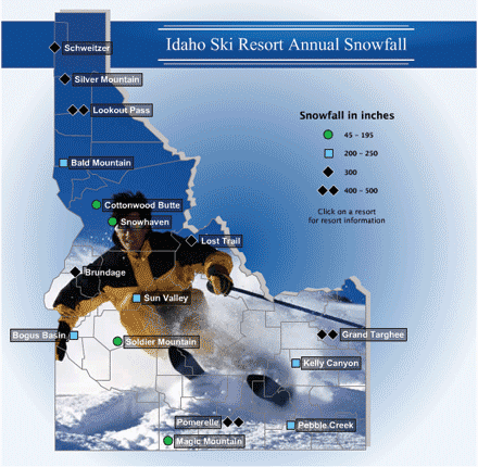
Poor Graphic

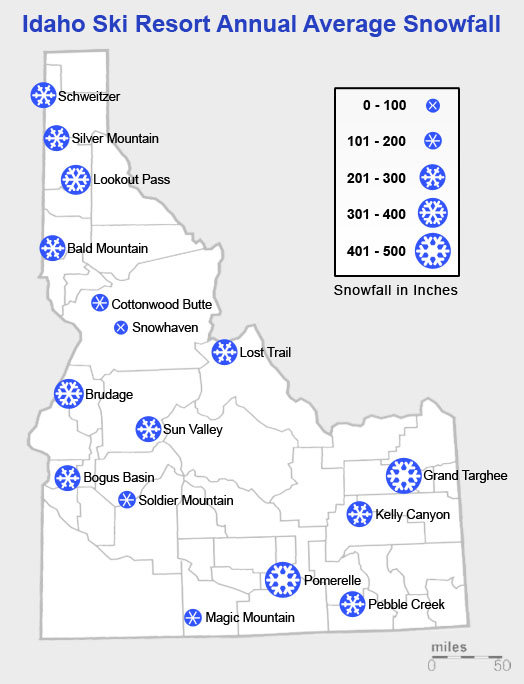
Resulting Graphic

[Seyfang, Fritz, Baldass, Schnabl, 2005]
Comparison
| Element | Poor Graphic | Worked Graphic |
|---|---|---|
| legend | The legend is inconsistent |
The symbols are continuous and follow the rules for representing non-metric but ordinary classes of ranges [1][Miksch, 2005] Moreover all 5 symbols have evaluated out of the same basic symbol (snowflake), and are thus consistent. Moreover the ranges which are represented by the symbols were made to descend into one another. |
| legend (symbols) | The root version, even though its symbols are inconsitent in shape and color, gives a rough impression where snow can be expected in a major amount. It provides the user with some sort of a rough overview about Idaho and the snowfall. This is information we thought is very useful. | The symbols now give a good impression where high amounts of snowfall can be expected. |
| legend (background) | The legend has no explicit bakground. | The legend now has a slight linear gradient from white (70% visible) to 100% visible white. This suggests the impression that the lower symbols (bigger) represent more snow. |
| background (map, the image) | Keeps no information (for the data of snowfall) | Was exchanged by a satellite view of Idaho, giving just the outer bounds of the state and the inner borders of the different districts. |
| background (radial gradient) | Is distracting the viewer, keeps no additional information. | Was changed to a very light gray background to keep a contrast between the shape of the land (which is white in large parts as well). |
| spot indicators (color) | The spot indicators are all of a different color, which can not at all be related to the amount of snow it should represent. | The color keeps no informations, so the attribute is dumped. |
| spot indicators (form) | Are inconsistent and the fourth one does not give a good idea where the center actually is (asymetric). | The new symbol has a clear center point, representing the spot on the map where the viewer can expect the place named. |
| spot description (background) | Contrast is not too good with the background of the boxes. | Whitening the background beneath the text for raising the contrast value for extra clear reading. On the other hand this is keeping the context (background) reasonable recognizeable. [2] |
| spot description (text) | The text is in white, which has a too low contrast most of the time due to the irregular color of the background image. | The text is written in simple black color. |
[1] [Miksch, 2005] Basic Understanding of Information Visualisation, Course Transparencies, p.29, Retrieved at: October 2005.
http://www.ifs.tuwien.ac.at/~silvia/wien/vu-infovis/PDF-Files/InfoVis-0-Defs.pdf
[2] [Miksch, 2005] Focus + Kontext, Course Transparencies, p.5 ff, Retrieved at: October 2005.
http://www.ifs.tuwien.ac.at/~silvia/wien/vu-infovis/PDF-Files/InfoVis-1.pdf