Teaching:TUW - UE InfoVis WS 2005/06 - Gruppe G7 - Aufgabe 2: Difference between revisions
No edit summary |
m (Typos) |
||
| Line 14: | Line 14: | ||
- '''color''': | - '''color''': | ||
Lines, bars and charts should be colored in a way, that | Lines, bars and charts should be colored in a way, that not one color stands out more prominently than the others, thus supporting the equal importance of the three data sets.[Few,2004] In our image the red and blue pies of the charts violate this principle because they stand out more prominently than the others. | ||
| Line 24: | Line 24: | ||
- '''past experience''': | - '''past experience''': | ||
That means that past experience have an effect | That means that past experience have an effect on how we see and interpret things.[Starl and Froschauer, 2005] You can say that our image somehow violates this principle. We are used to read from left to right, but the charts on the image are organized from right to left. This can be confusing. | ||
| Line 41: | Line 41: | ||
== Changes == | == Changes == | ||
Our objective was to present the information as simple and transparent as possible. In order to achieve this, we use a two-dimensional diagram with grouped bars. It is much easier to compare the different values with one another than it was before. The different colours are clearly distinguishable on white background, the values are good readable and the | Our objective was to present the information as simple and transparent as possible. In order to achieve this, we use a two-dimensional diagram with grouped bars. It is much easier to compare the different values with one another than it was before. The different colours are clearly distinguishable on white background, the values are good readable and the temporal sequence goes from left to right. We intentionally abstained from a three-dimensional look because it is not necessary and moreover confuses the viewer. | ||
All in all the graphic looks much more orderly and simplified. | All in all the graphic looks much more orderly and simplified. | ||
Revision as of 14:52, 3 November 2005
Poor Graphic

Drawbacks
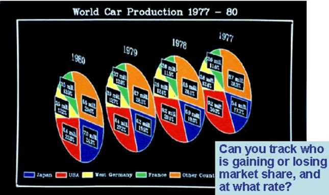
This image is far away from a good Visualization of the underlying Data. It has drawbacks according to some well known Design Principles, which we will explain in the following:
- data ink:
Everything that communicates actual data is data ink and is needed.[Few,2004] But our image contains some unnecessary data ink. The white Border around all the charts and the white lines around each single chart and between the pies of the charts are unnecessary data ink.
- color:
Lines, bars and charts should be colored in a way, that not one color stands out more prominently than the others, thus supporting the equal importance of the three data sets.[Few,2004] In our image the red and blue pies of the charts violate this principle because they stand out more prominently than the others.
- lie factor:
The lie lactor is a value to describe the relation between the size of effect shown in a graphic and the size of effect shown in the data.[Muster et al.,2005] The first problem is, it seems that we look at the image not from the front but a little from the side. That distorts the message since neither the angles nor the areas are in proportion to the data.[Seyfang et al., 2005] The second one is that the charts have different distances to each other. The distance of the chart 1977 to the chart 1978 is shorter than that from 1979 to 1980. It schould be the same.
- past experience:
That means that past experience have an effect on how we see and interpret things.[Starl and Froschauer, 2005] You can say that our image somehow violates this principle. We are used to read from left to right, but the charts on the image are organized from right to left. This can be confusing.
- simplicity:
You should keep your image as simple as possible, which also means that you have to reduce redundant information.[Few,2004] Our image violates this principle. The percentage of a lands contribution to the world production is shown on one hand via the angle and size of the pies and on the other hand it is written numerical above the pies.
Updated Picture
Changes
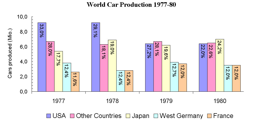
Our objective was to present the information as simple and transparent as possible. In order to achieve this, we use a two-dimensional diagram with grouped bars. It is much easier to compare the different values with one another than it was before. The different colours are clearly distinguishable on white background, the values are good readable and the temporal sequence goes from left to right. We intentionally abstained from a three-dimensional look because it is not necessary and moreover confuses the viewer. All in all the graphic looks much more orderly and simplified.
Resources
- [1] [Few, 2004] Stephen Few, Elegance Through Simplicity, Intelligent Enterprise, Access Date: 26 October 2005, http://www.intelligententerprise.com/showArticle.jhtml;jsessionid=N2ATDQWY5VYKSQSNDBGCKHSCJUMEKJVN?articleID=49400920
- [2] [Seyfang et al., 2005] Leonhard Seyfang, Heinrich Fritz, Stefan Schnabl, Gioia Baldass , Gruppe G8 - Aufgabe 1 - Chart Junk, InfoVis Wiki, Access Date: 26 October 2005, http://www.infovis-wiki.net/index.php/Teaching:TUW_-_UE_InfoVis_WS_2005/06_-_Gruppe_G8_-_Aufgabe_1_-_Chart_Junk
- [3] [Muster et al.,2005] Anna Muster, Jürgen Puchta, Christian Rainer, Christoph Sölder, Gruppe G4 - Aufgabe 1 - Lie Factor, InfoVis Wiki, Access Date: 26 October 2005, http://www.infovis-wiki.net/index.php/Teaching:TUW_-_UE_InfoVis_WS_2005/06_-_Gruppe_G4_-_Aufgabe_1_-_Lie_Factor
- [4] [Starl and Froschauer, 2005] Erwin Starl, Joseph Froschauer, Gruppe G7 - Aufgabe 1, InfoVis Wiki, Access Date: 26 October 2005, http://www.infovis-wiki.net/index.php/Teaching:TUW_-_UE_InfoVis_WS_2005/06_-_Gruppe_G7_-_Aufgabe_1_-_Gestalt_Laws
