Data-Ink Ratio: Difference between revisions
| Line 26: | Line 26: | ||
First an example of a graph with a low Data-Ink Ratio | First an example of a graph with a low Data-Ink Ratio | ||
[[Image:DIR.gif|thumb|400px| | [[Image:DIR.gif|thumb|400px|center]] | ||
How much of the ink on this chart could be removed without loss of information? | How much of the ink on this chart could be removed without loss of information? | ||
| Line 37: | Line 37: | ||
<br> | <br> | ||
Now an example of a graph with a high Data-Ink Ratio | Now an example of a graph with a high Data-Ink Ratio | ||
[[Image:DIR2.jpg|thumb|400px| | [[Image:DIR2.jpg|thumb|400px|center]] | ||
Revision as of 21:39, 25 October 2005
Definitions
Tufte defines two types of ink used to construct a graph:
- data-ink - the essential non-erasable ink used to present the data
- non-data-ink - the redundant ink used to elaborate or decorate the graph
The Data-Ink Ratio is defined as the percentage: (100 x Data-ink) / (Total ink used on graphic)
[home.ched.coventry.ac.uk]
Introduction
The Data-Ink Ratio is a concept published by Tufte in [Tufte83]. It arose from Tuftes goal "Above all else show the data".
"A large share of ink on a graphic should present data-information, the ink changing as the data change. Data-ink is the non-erasable core of a graphic, the non-redundant ink arranged in response to variation in the numbers represented."
The data-ink ratio is the proportion of ink (or pixels, when displaying information on a screen) that's used to present actual data, without redundancy, compared to the total amount of ink (or pixels) used in the entire display, such as in a table or graph. The goal is to design a display that has the highest possible data-ink ratio (that is, as close to the total of 1.0 or 100% as possible), without eliminating something that is necessary for effective communication.
Example
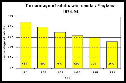
First an example of a graph with a low Data-Ink Ratio

How much of the ink on this chart could be removed without loss of information?
- The word "Year" is superflous
- Only the first year needs to include the digits 19
- Either the data labels or the vertical scale could be removed
- The y-axis label is duplicated in the title
- The bars need not be coloured
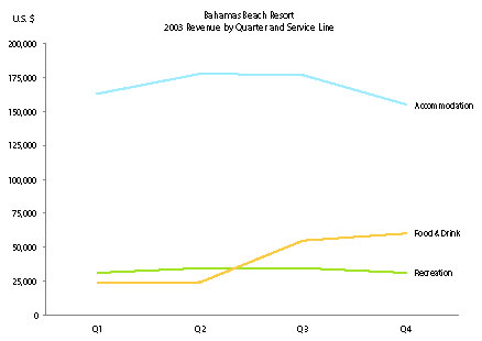
Now an example of a graph with a high Data-Ink Ratio
