Applying Animation to the Visual Analysis of Financial Time-Dependent Data: Difference between revisions
(added abstract) |
(added figures) |
||
| Line 5: | Line 5: | ||
== Abstract == | == Abstract == | ||
{{Quotation|For decades, financial analysts have strived to use modern data visualization tools to improve the timeliness and quality of their analysis. As the amount of data to be processed increases rapidly and requirements on quality of financial analysis rise, the demand for analysis support systems grows. We present a system for the visual analysis of large amounts of time-dependent data using animation. For each data entity, indicators are presented in a scatter-plot framework, displaying the correlation between them. The design of the glyphs illustrates additional data dimensions. The system uses animation to handle the time-dimension of the data. It offers various features, such as focus, zoom, details on demand and time period selection to support the analysis. Financial indicators are used to demonstrate the usability of the system. The animation proves to be a powerful tool for analysing time-dependent processes in cross-sectional data sets and discovering patterns in the data.| [Tekusova and Kohlhammer, 2007]}} | {{Quotation|For decades, financial analysts have strived to use modern data visualization tools to improve the timeliness and quality of their analysis. As the amount of data to be processed increases rapidly and requirements on quality of financial analysis rise, the demand for analysis support systems grows. We present a system for the visual analysis of large amounts of time-dependent data using animation. For each data entity, indicators are presented in a scatter-plot framework, displaying the correlation between them. The design of the glyphs illustrates additional data dimensions. The system uses animation to handle the time-dimension of the data. It offers various features, such as focus, zoom, details on demand and time period selection to support the analysis. Financial indicators are used to demonstrate the usability of the system. The animation proves to be a powerful tool for analysing time-dependent processes in cross-sectional data sets and discovering patterns in the data.| [Tekusova and Kohlhammer, 2007]}} | ||
== Figures == | |||
[[Image:Tekusova_kohlhammer_fig1.jpg]]<br> | |||
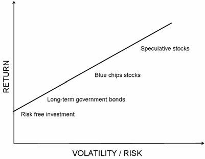
The figure shows the relationship between return and volatility for some example asset categories. It is usual that riskier assets can mean higher returns and vice versa. {{Quotation|The relationship between volatility and return over time is at the centre of the investors' atteintion.| [Tekusova and Kohlhammer, 2007]}}<br><br> | |||
[[Image:Tekusova_kohlhammer_fig2.jpg]]<br> | |||
The FinMotion userinterface is divided into two areas: | |||
* Main visualisation window | |||
* Interaction panel | |||
The window contains five panes as it can be seen on the picture. | |||
* Pane 1: "Scatter plot view": Is used for viewing scatter plots which are very important for the analysis. The interaction panel consists of tools to manipulate the scatter plot view. | |||
* Pane 2: "Data": Provides tools to manipulate data and get data descriptions. | |||
* Pane 3: "Data selection": Provides features for selecting data. | |||
* Pane 4: "View settings": Provides more features for data visualization and manipulation. | |||
* Pane 5: "Animation": Provides tools for manipulationg motion features. | |||
<br><br> | |||
[[Image:Tekusova_kohlhammer_fig3.jpg]]<br> | |||
Negativ values in the scatter plot are represented as unfilled rectangles. The size of the rectangle represants the absolute value of the data point. | |||
<br><br> | |||
[[Image:Tekusova_kohlhammer_fig4.jpg]]<br> | |||
The animation of data points can be a very powerful tool but it hides the history. Therefore users can choose to show trajectory paths during animation. | |||
<br><br> | |||
[[Image:Tekusova_kohlhammer_fig5.jpg]]<br> | |||
Focus and Zoom: Users can define "target stocks". Selected data items keep their original colour and other items are coloured in grey. This gives the users the possibility to concentrate on interesting data. This feature is also very useful because of the overlapping glyphs problem. | |||
<br><br> | |||
[[Image:Tekusova_kohlhammer_fig6.jpg]]<br> | |||
This picture shows the "Details on Demand" feature of FinMotion. | |||
{{Quotation|As users may wish more information on visualised data, a legend and further information on demand are provided.| [Tekusova and Kohlhammer, 2007]}} | |||
<br><br> | |||
[[Image:Tekusova_kohlhammer_fig7.jpg]]<br> | |||
The legend text placement was a major challenge. The legend text can be places somewhere around the glyph in the grey area. The algorithm the authors used works fine, but it is impossible to overcome the overlapping legend problem completely. | |||
<br><br> | |||
[[category: techniques]] | [[category: techniques]] | ||
Revision as of 23:27, 8 May 2008
Authors
Abstract
Figures
The figure shows the relationship between return and volatility for some example asset categories. It is usual that riskier assets can mean higher returns and vice versa.
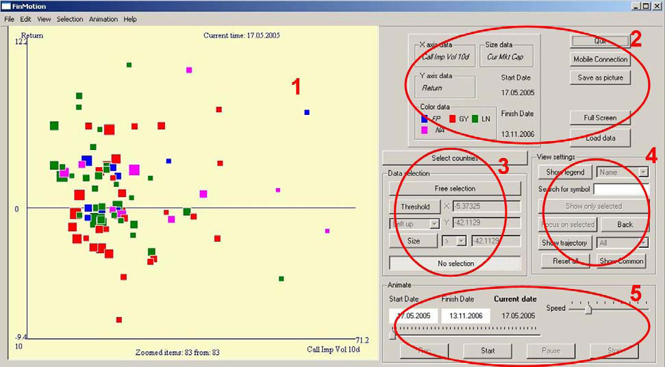
The FinMotion userinterface is divided into two areas:
- Main visualisation window
- Interaction panel
The window contains five panes as it can be seen on the picture.
- Pane 1: "Scatter plot view": Is used for viewing scatter plots which are very important for the analysis. The interaction panel consists of tools to manipulate the scatter plot view.
- Pane 2: "Data": Provides tools to manipulate data and get data descriptions.
- Pane 3: "Data selection": Provides features for selecting data.
- Pane 4: "View settings": Provides more features for data visualization and manipulation.
- Pane 5: "Animation": Provides tools for manipulationg motion features.

Negativ values in the scatter plot are represented as unfilled rectangles. The size of the rectangle represants the absolute value of the data point.
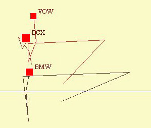
The animation of data points can be a very powerful tool but it hides the history. Therefore users can choose to show trajectory paths during animation.
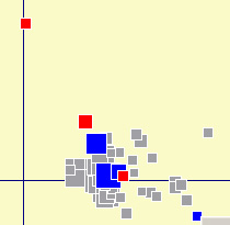
Focus and Zoom: Users can define "target stocks". Selected data items keep their original colour and other items are coloured in grey. This gives the users the possibility to concentrate on interesting data. This feature is also very useful because of the overlapping glyphs problem.
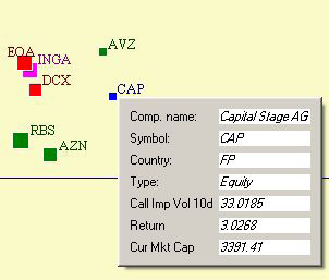
This picture shows the "Details on Demand" feature of FinMotion.

The legend text placement was a major challenge. The legend text can be places somewhere around the glyph in the grey area. The algorithm the authors used works fine, but it is impossible to overcome the overlapping legend problem completely.
